css
Understanding CSS sprites
author
Luis Paredes
published
Apr 22, 2023
Sprites have been a convenient technique to display several pictures on a single web page using a single source image.
However, even though the technique has been around for many years, it is sometimes confusing, since it requires understanding the way background coordinates work in CSS.
In this post we'll take a look at the typical sprite patterns using raw CSS and also explain the logic of how it works.
Why to use sprites in the first place?
The main reason to use sprites is to reduce the number of HTTP requests made to retrieve images, which could improve how fast the page is loaded.
Notice that if the image containing the sprites is too big, the users may see a blank space in all of the places where the sprites are shown while the image is being loaded.
General pattern
First, you'll need an image displaying the sprites you want to show in the page. For this example we're going to be using this 200px x 200px image:
Then, you'll need to create as many HTML elements as you need to display the sprites you want to show (one element per sprite).
The tag you use will depend on the context in which you want to display the sprite, however, spans and divs are usually the common choice.
<div class="sprite" role="img" aria-label=""></div>
<div class="sprite" role="img" aria-label=""></div>
<div class="sprite" role="img" aria-label=""></div>
<div class="sprite" role="img" aria-label=""></div>
Notice that we also add the proper ARIA role (image) to each of the sprite elements to comply with accessibility best practices, as well as an aria-label describing the content.
For the CSS, we'll need three things to define the sprite behavior:
- Set the sprite image as the background of the sprite elements
- Define the size of the sprite element
- Define the position of the background within the element (taking into account the element's size and the background image size)
.sprite {
background: url();
height: 100px;
width: 100px;
margin-right: 8px;
}
/**
* This one can be avoided since 0 0 is the default value, I only added it for
* explanation purposes
*/
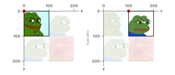
.sprite:nth-child(1) {
background-position: 0 0;
}
.sprite:nth-child(2) {
background-position: 100px 0;
}
.sprite:nth-child(3) {
background-position: 0 100px;
}
.sprite:nth-child(4) {
background-position: 100px 100px;
}
On the other hand, I also added an extra CSS rule to add some blank space between the elements so that they look better on the page, however, that's not directly related to the basic sprite pattern, and you may choose to add any extra CSS rules using other selectors (it will depend on your overall CSS structure strategy).
How does it work?
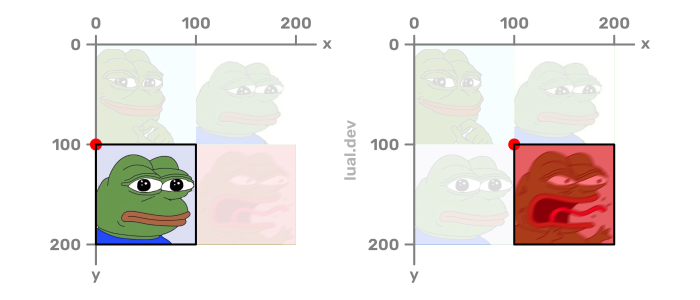
When we set the background to display an image, the default behavior is to place the image with its original size at the top left corner of the element and repeat it both vertically and horizontally if needed to fill the available space.

On the other hand, any part of the image that goes beyond the limits of the element gets cropped, and this is precisely the behavior we use to be able to only show a specific sprite even though the background image contains more elements.
We accomplish this by playing with the position of the background, using the top left corner of the element as the origin of our coordinate system:
Alternatives
Pattern alternatives
There are other CSS properties that may come handy when working with sprites, namely:
background-position-xbackground-position-ybackground-sizebackground-clip
You could, for instance, substitute a single background-position: <x-coordinate> <y-coordinate>; statement by two statements declaring the X and Y coordinates separately:
background-position-x: <x-coordinate>;
background-position-y: <y-coordinate>;
On the other hand, if you need to scale the sprites, you could take advantage of the background-size property and update the position using the new scale as reference. For example, if we wanted to display our example at half the size, we could use the following CSS:
.sprite {
  background: url();
  height: 50px;
  width: 50px;
  margin-right: 8px;
  background-size: 100px 100px;
}

/**
 * This one can be avoided since 0 0 is the default value, I only added it for
 * explanation purposes
 */
.sprite:nth-child(1) {
  background-position: 0 0;
}

.sprite:nth-child(2) {
  background-position: 50px 0;
}

.sprite:nth-child(3) {
  background-position: 0 50px;
}

.sprite:nth-child(4) {
  background-position: 50px 50px;
}
Lastly, if we're using a sprite image with some padding between the sprites, we could take advantage of the background-clip property to trim the blank space.
Performance alternatives
"Back in the day" (yup, I've been coding for a long time 😅), a common application of sprites in web development was including social icons, or icons in general, however, nowadays using inline SVG has become the best practice since it doesn't use not even a single extra HTTP request because the SVG icon is just another element within the HTML page.
Furthermore, depending on what you want to accomplish, techniques like lazy loading or using picture elements may be a better solution for improving performance.
Conclusion
We've seen how to implement the sprite technique, when to use it and possible alternatives depending on the use case.
I hope that by now you've gain a better understanding of the technique, and feel more confident when using it.