css
Centering Elements in CSS: The Definitive Guide
author
Luis Paredes
published
Aug 14, 2023
Centering elements is a fundamental skill for any web developer coding frontend. It's essential for creating layouts that are both visually appealing and functional. In this guide, we'll cover everything you need to know about centering elements in CSS, from the basics to the advanced.
We'll start by understanding the difference between inline and block elements and how it affects the approaches we can use to center either type of element. Then, I'll show you how to center elements horizontally and vertically, both for inline and block elements, and we'll also also some advanced techniques for centering elements, such as using flexbox and CSS Grid.
By the end of this guide, you'll be a centering master!
Inline elements vs block elements
In CSS, there are two main types of elements: inline and block. The way that these elements are rendered on the page is different, which affects how we can center them.
- Inline elements are rendered on the same line as the text around them. They do not take up the full width of the page, and they do not start on a new line unless they are followed by another inline element. Some examples of inline elements include
<span>,<a>, and<img> - Block elements start on a new line and take up the full width of the page. They are not affected by the text around them. Some examples of block elements include
<p>,<div>, and<h1>
When we want to center an element, we need to take into account whether it is an inline element or a block element because the centering technique will vary depending on the type. In the next sections we'll dig deeper into the details of what technique to use for each element type in all centering scenarios.
How to center elements horizontally?
Centering inline elements horizontally
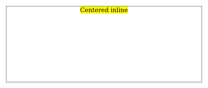
To center an inline element horizontally, we can use the text-align: center property. This will center the element within the text around it.
For example, let's say we have the following HTML code:
<div class="inline-container">
  <span> Centered inline </span>
</div>
We can center this element horizontally by adding the following CSS code:
.inline-container {
  text-align: center;

  /* added for presentation purposes */
  height: 200px;
  border: 1px solid;
}

.inline-element {
  /* added for presentation purposes */
  background: yellow;
}
This will center the inline element (the span with the text) as shown below:
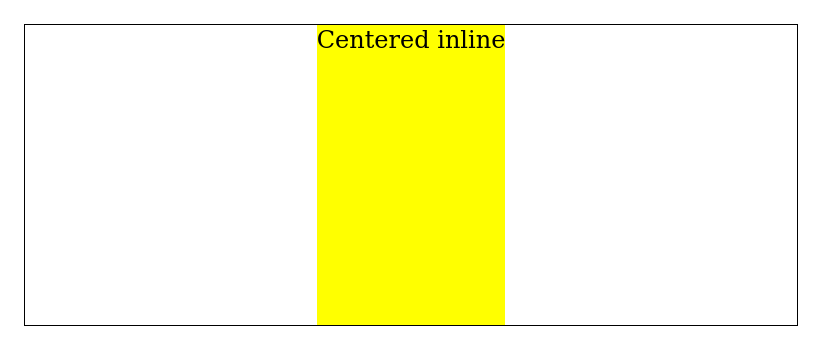
Alternatively, we can use flexbox as follows:
.inline-container {
  display: flex;
  justify-content: center;

  /* added for presentation purposes */
  height: 200px;
  border: 1px solid;
}

.inline-element {
  /* added for presentation purposes */
  background: yellow;
}
This will also center the element horizontally but also expand to fill the entire vertical space:
Centering block elements horizontally
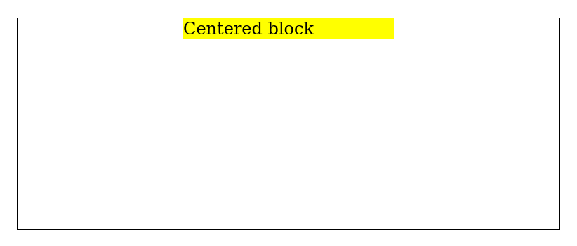
To center a block element horizontally, we can set the horizontal margin of the element to auto. Applying this property will center the element within the width of its parent container.
For instance, if we have the following HTML code:
<div class="block-container">
  <div class="block-element">Centered block</div>
</div>
We can center block-container element horizontally by adding the following CSS code:
.block-container {
  /* added for presentation purposes */
  border: 1px solid;
  height: 200px;
}

.block-element {
  margin: auto;

  /* added for presentation purposes */
  width: 200px;
  background: yellow;
}
This will center the block element within the width of its parent container, as shown below:
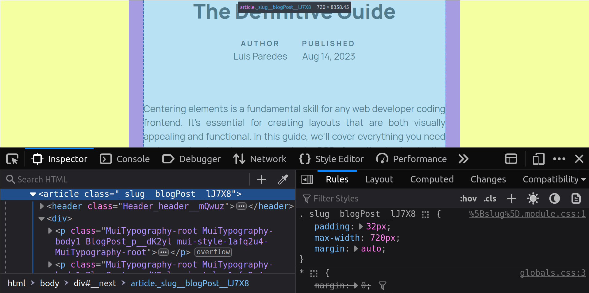
Notice that this approach is useful for creating wrappers that limit the maximum size of a page content while keeping it centered horizontally. If you inspect the source code of this page, you'll see that this approach is used for the article:
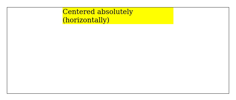
An alternative approach is using absolute positioning alongside the transform property as follows:
<div class="relative-container">
  <div class="absolute-child-x">Centered absolutely (horizontally)</div>
</div>
.relative-container {
  position: relative;

  /* added for presentation purposes */
  border: 1px solid;
  height: 200px;
}

.absolute-child-x {
  position: absolute;
  left: 50%;
  transform: translateX(-50%);

  /* added for presentation purposes */
  background: yellow;
}
How to vertically center elements?
Centering inline elements vertically
The approach we use for centering inline elements vertically will depend on the semantic meaning of the text and whether or not the text wraps (multiline text).
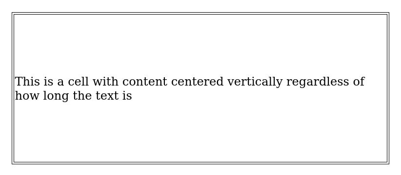
If we're working with text inside a cell in a tabular data context, we could simply use vertical-align: middle as this property works inside display: table-cell:
<table>
  <tr>
    <td>This is a cell with content centered vertically regardless of how long the text is</td>
  </tr>
</table>
table {
  /* added for presentation purposes */
  border: 1px solid;
}

td {
  border: 1px solid;
  /* vertical-aligm: middle; is the default */

  /* added for presentation purposes */
  height: 200px;
}
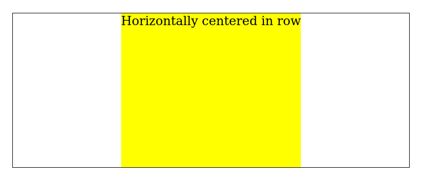
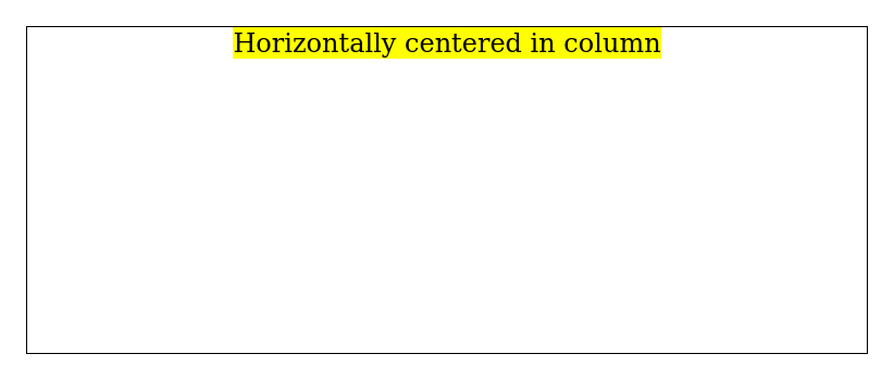
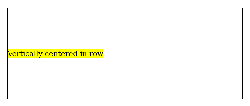
For all other contexts, we can use flexbox, either by justifying to the center alongside the column direction or by aligning to the center when working with the row direction (default flex-direction):
<div class="flex-row">
  <div class="child">Horizontally centered in row</div>
</div>
<div class="flex-column">
  <div class="child">Horizontally centered in column</div>
</div>
.flex-row {
  display: flex;
  justify-content: center;

  /* added for presentation purposes */
  border: 1px solid;
  height: 200px;
}

.flex-column {
  display: flex;
  flex-direction: column;
  align-items: center;

  /* added for presentation purposes */
  border: 1px solid;
  height: 200px;
}

.child {
  /* added for presentation purposes */
  background: yellow;
}
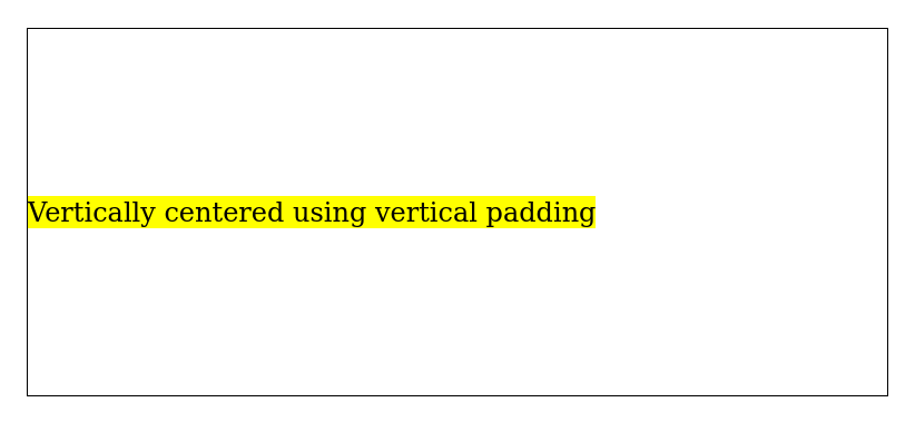
Another simple approach that comes handy for centering vertically is using the same value for both the top and bottom padding:
<div class="vertical-padding">
  <span class="element">
    Vertically centered using vertical padding
  </span>
</div>
.vertical-padding {
  padding: 100px 0;

  /* added for presentation purposes */
  border: 1px solid;
}

.element {
  /* added for presentation purposes */
  background: yellow;
}
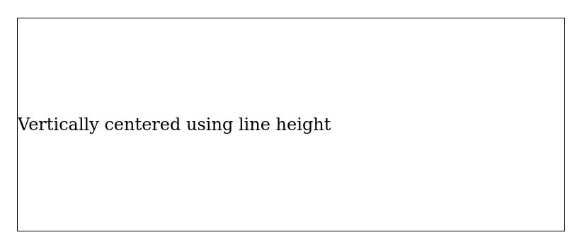
Last but certainly not least, if we have a single line of text, we can use this line-height hack:
<div class="line-height-hack">
  Vertically centered using line height
</div>
.line-height-hack {
  height: 200px;
  line-height: 200px; /* mathches the height */
  white-space: nowrap;

  /* added for presentation purposes */
  border: 1px solid;
}
Centering block elements vertically
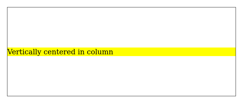
There are 3 main approaches for centering block elements vertically, namely: using flexbox, using absolute positioning and using vertical padding.
If you decide to use flexbox, you'll use the align-items property for centering items vertically if the flex-direction is set to row (the default direction) or justify-items if it's set to column:
<div class="flex-row">
  <div class="child">Vertically centered in row</div>
</div>
<div class="flex-column">
  <div class="child">Vertically centered in column</div>
</div>
.flex-row {
  display: flex;
  align-items: center;

  /* added for presentation purposes */
  border: 1px solid;
  height: 200px;
}

.flex-column {
  display: flex;
  flex-direction: column;
  justify-content: center;

  /* added for presentation purposes */
  border: 1px solid;
  height: 200px;
}

.child {
  /* added for presentation purposes */
  background: yellow;
}
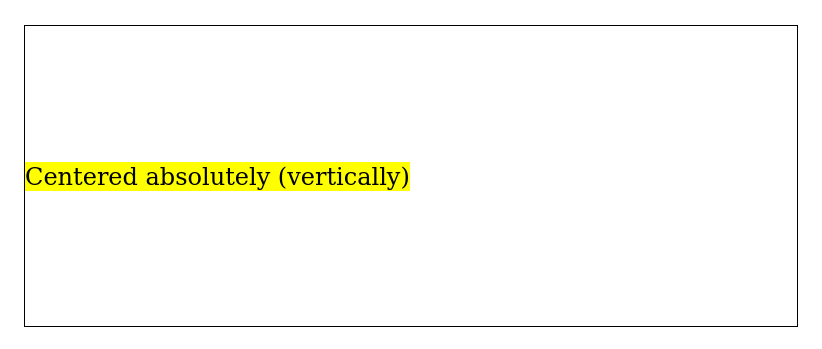
Using the transform property along with absolute positioning can also help achieve vertical centering for block elements:
<div class="container">
  <div class="absolute-child-y">Centered absolutely (vertically)</div>
</div>
.container {
  position: relative;

  /* added for presentation purposes */
  border: 1px solid;
  height: 200px;
}

.absolute-child-y {
  position: absolute;
  top: 50%;
  transform: translateY(-50%);

  /* added for presentation purposes */
  background: yellow;
}
Finally, the vertical padding technique that we applied to inline elements can also be used for block elements without requiring any modifications.
How to center elements both horizontally and vertically?
When it comes to centering elements in both axis, the two most important approaches are using flexbox and using absolute positioning.
The flexbox approach works for both inline and block elements, and if you didn't skip the previous sections, by now you've probably realized that it's only a matter of combining the technique used to center elements horizontally and the technique used for centering elements vertically:
<div class="flex-container">Centered</div>
.flex-container {
  display: flex;
  justify-content: center;
  align-items: center;

  /* added for presentation purposes */
  border: 1px solid;
  height: 200px;
}
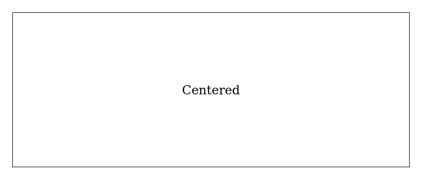
Notice that in this case, the flex direction doesn't matter because we're centering the element along both axes.
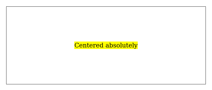
On the other hand, using absolute centering only works for block elements because the centered component needs to be of that type for it to be able support display: absolute. Centering on both axes using this approach is only a matter of combining what we already saw about centering horizontally and centering vertically:
<div class="relative-container">
  <div class="absolute-child">Centered absolutely</div>
</div>
.absolute-child {
  position: absolute;
  top: 50%;
  left: 50%;
  transform: translate(-50%, -50%);

  /* added for presentation purposes */
  background: yellow;
}
Conclusion
Mastering the art of centering elements in CSS opens up a world of possibilities for creating visually appealing and balanced web layouts. By understanding the distinctions between inline and block elements and employing various techniques like text alignment, margin auto, flexbox, and CSS Grid, you can confidently craft designs that resonate with users across different devices and screen sizes.
While there are other context specific methods for centering that were not covered in the article, I'm confident that this guide covers almost all of the use cases you'll encounter on a regular basis. Happy centering! 😜